

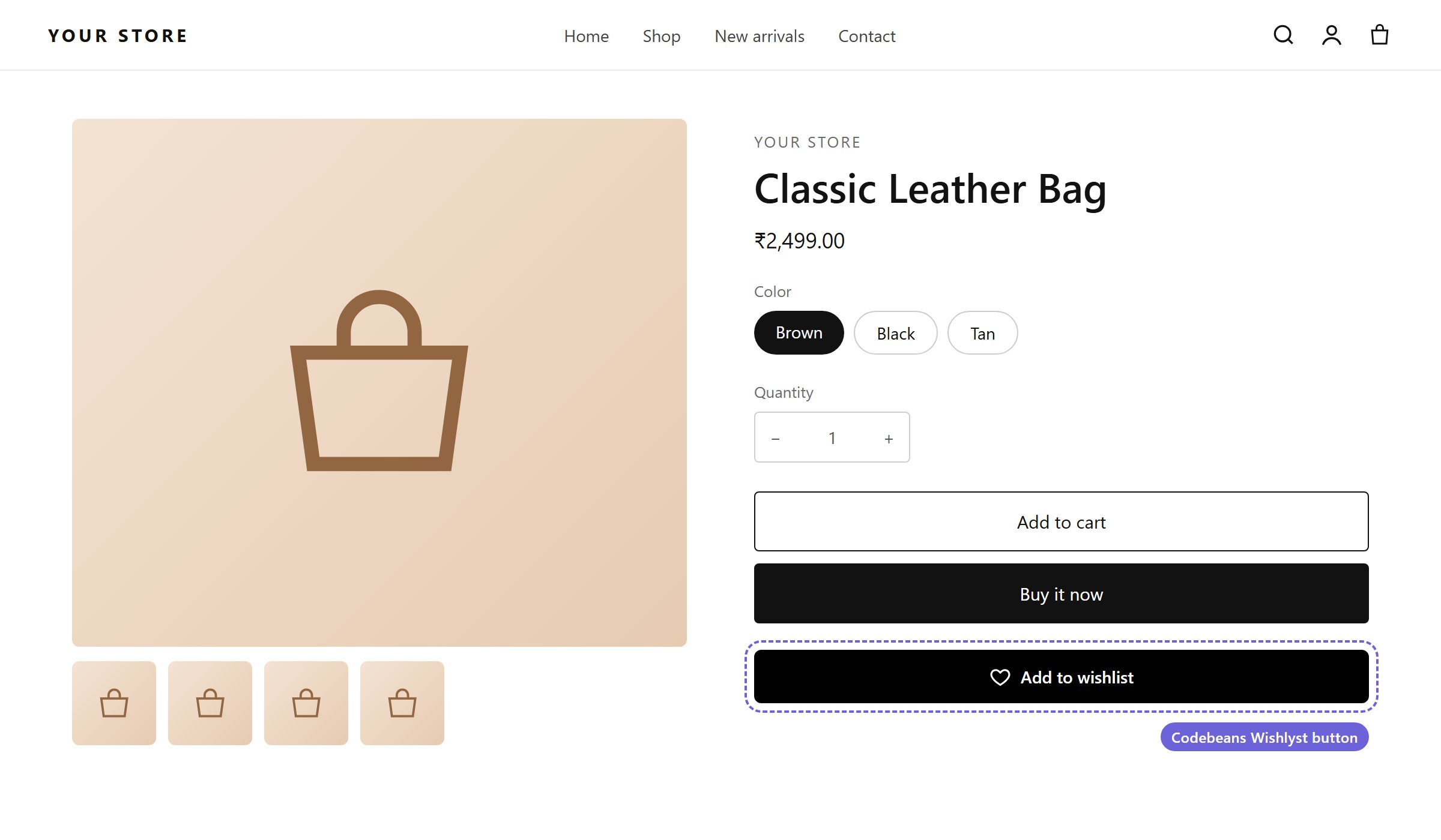
The Add to wishlist button on a product page (default style)
The Add to Wishlist Button toggle under Insights → Wishlist Settings must be activated, and the Wishlist icon app embed must be on.
Button position
Choose one placement: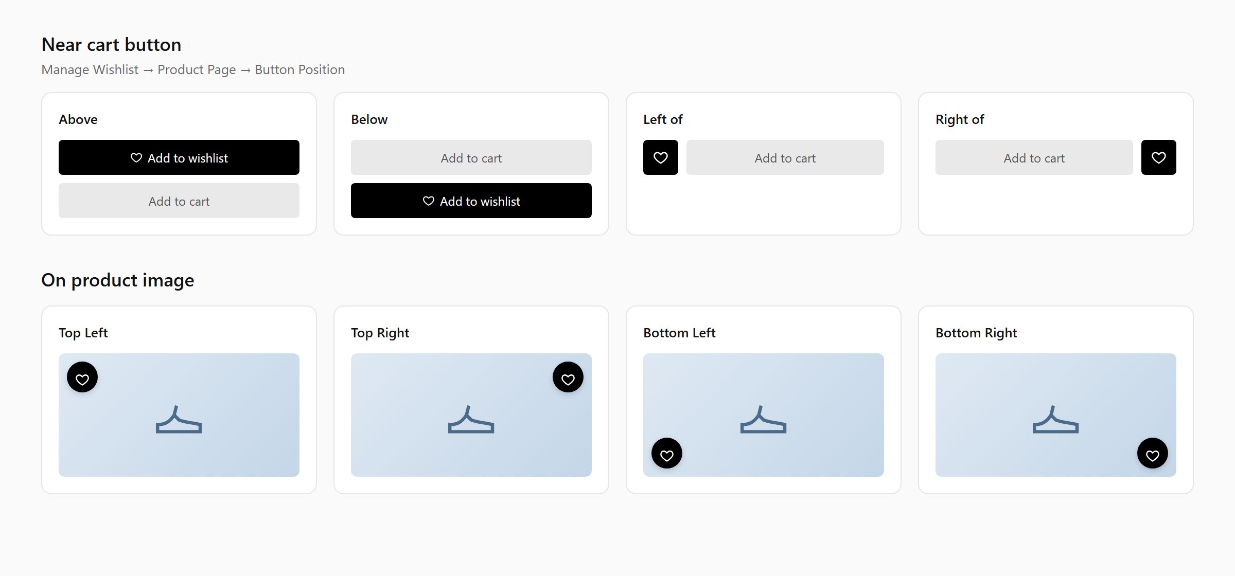
All eight button positions
- On product image
Custom CSS selectors
If the button does not appear, or appears in the wrong place, tell the app where to put it:Button type and text
- Button Type: Icon and Text (default), Only Text or Only Icon.
- Label: the button text. Default:
Add to wishlist.
Appearance
Colors and icon
- Icon Colors: Icon Color, Icon Hover Color, Icon Border Color, Icon Hover Border Color.
- Text Colors: Text Color, Text Hover Color.
- Icon styles: Icon size (10–60 px) and Icon border width (0–10 px).
Placing the button yourself
To put the button in a specific place, or style one button differently from the rest, use the Add to Wishlist Button app block:- Online Store → Themes → Customize, open a product template.
- In the product information section, Add block → Apps → Add to Wishlist Button.
- Optionally change its settings. Fields you leave blank use the settings from this tab.